Design at scale
Creating accessible, scalable design systems powered by AI, motion, and proven product impact.
![[interface] screenshot of software in action (for an ai saas company)](https://cdn.prod.website-files.com/6866af3dd96fd19bc1b1347d/68b87e1a2cfe90be01f85ba6_1.jpg)
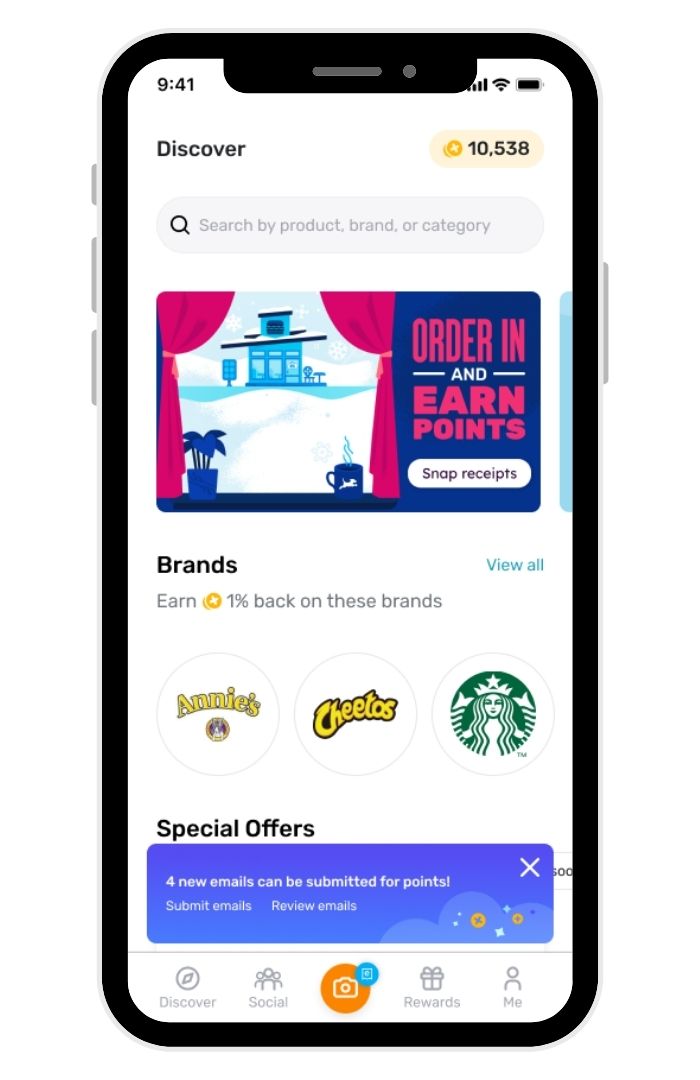
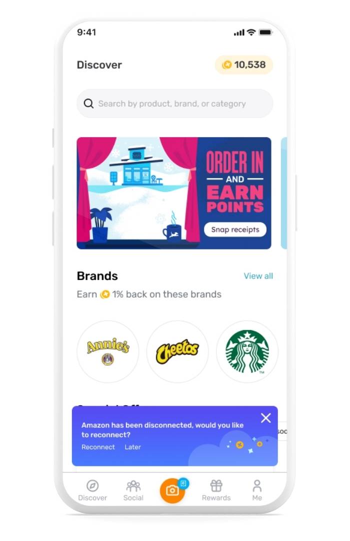
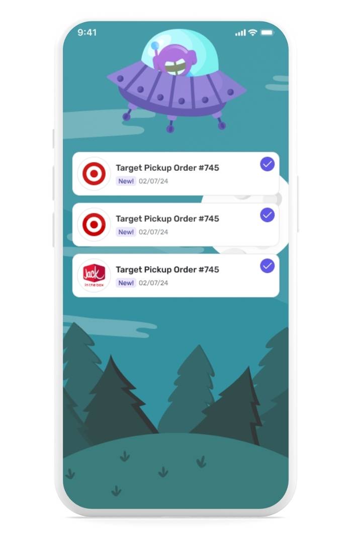
Consolidated the design system and shifted to native iOS and Android design instead of a web wrapper, improving efficiency, usability, and long-term scalability.
![[interface] screenshot of software in action (for an ai saas company)](https://cdn.prod.website-files.com/6866af3dd96fd19bc1b1347d/68cec1a011d817ead241f1c6_Launchpad%20-%201440%20-%20Updated.png)
Redesigned Citrix Cloud components with a modern design system, elevating the visual language to a consumer-grade experience for the next generation of enterprise admins.
![[interface] screenshot of software in action (for an ai saas company)](https://cdn.prod.website-files.com/6866af3dd96fd19bc1b1347d/68cec00c52cbf31dde37a711_motionpoint.png)
Built the company’s first design system, unifying a fragmented suite of products into a cohesive language and shared component library, enabling updates in weeks instead of months.
![[interface] screenshot of software in action (for an ai saas company)](https://cdn.prod.website-files.com/6866af3dd96fd19bc1b1347d/68cec0e8b823b1ae9333dee1_Properties.png)
Advanced design systems with AI-generated accessible palettes and scalable motion tokens, ensuring consistency across platforms while future-proofing brand and product experiences.
![[interface] screenshot of the software interface (for a productivity tools business)](https://cdn.prod.website-files.com/6866af3dd96fd19bc1b1347d/68a6486d7dfce5af3a0d7d2b_Screenshot%202025-08-20%20at%206.12.49%20PM.png)
![[interface] screenshot of the software interface (for a productivity tools business)](https://cdn.prod.website-files.com/6866af3dd96fd19bc1b1347d/68a8724ac5550d9db729c231_Screenshot%202025-08-22%20at%209.35.40%20AM.png)
![[interface] screenshot of the software interface (for a productivity tools business)](https://cdn.prod.website-files.com/6866af3dd96fd19bc1b1347d/68a8715b7b9b3de8cf851376_Screenshot%202025-08-22%20at%209.31.50%20AM.png)
![[interface] screenshot of the software interface (for a productivity tools business)](https://cdn.prod.website-files.com/6866af3dd96fd19bc1b1347d/68b83c130798ac818e2396c1_Iterations%202.png)